The Work
Adobe's new token system leveraged a complex custom property cascade build to support four color themes, two design themes, RTL languages, and Windows High Contrast Mode. The work had several requirements.
Update the CSS
The migration work included updating any outdated code and integrating new CSS once it was approved by Adobe engineers (and caniuse.)
Collaborate with Design and Engineering
Adobe's designers provided specs for design updates along with token usage instructions. New CSS was required for components featuring significant design changes, new variants, and new child component dependencies. Designers were often consulted to clarify variant behaviors and appearance as the migration work progressed.
Adobe's Spectrum design website also contains new and existing design specs which were integrated.
Enhance the Documentation
Our team contributed new documentation within the CSS as we did our migration work for easier developer wayfinding. We followed a BEM approach to components, modified to match Adobe's existing markup conventions. We were also tasked with updating markup in the design system's YML files so new variants and design requirements were reflected on the docs site.
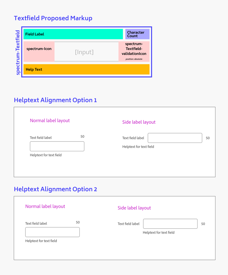
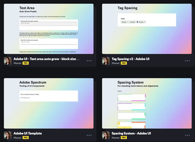
I used Adobe XD and Figma to illustrate design questions, such as in this visual representation of textfield markup and two possible helptext alignments.
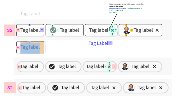
I used Figma visuals like this as well as Codepens to check for design fidelity.
Migrated Components
A Sampling of some of the components I migrated.
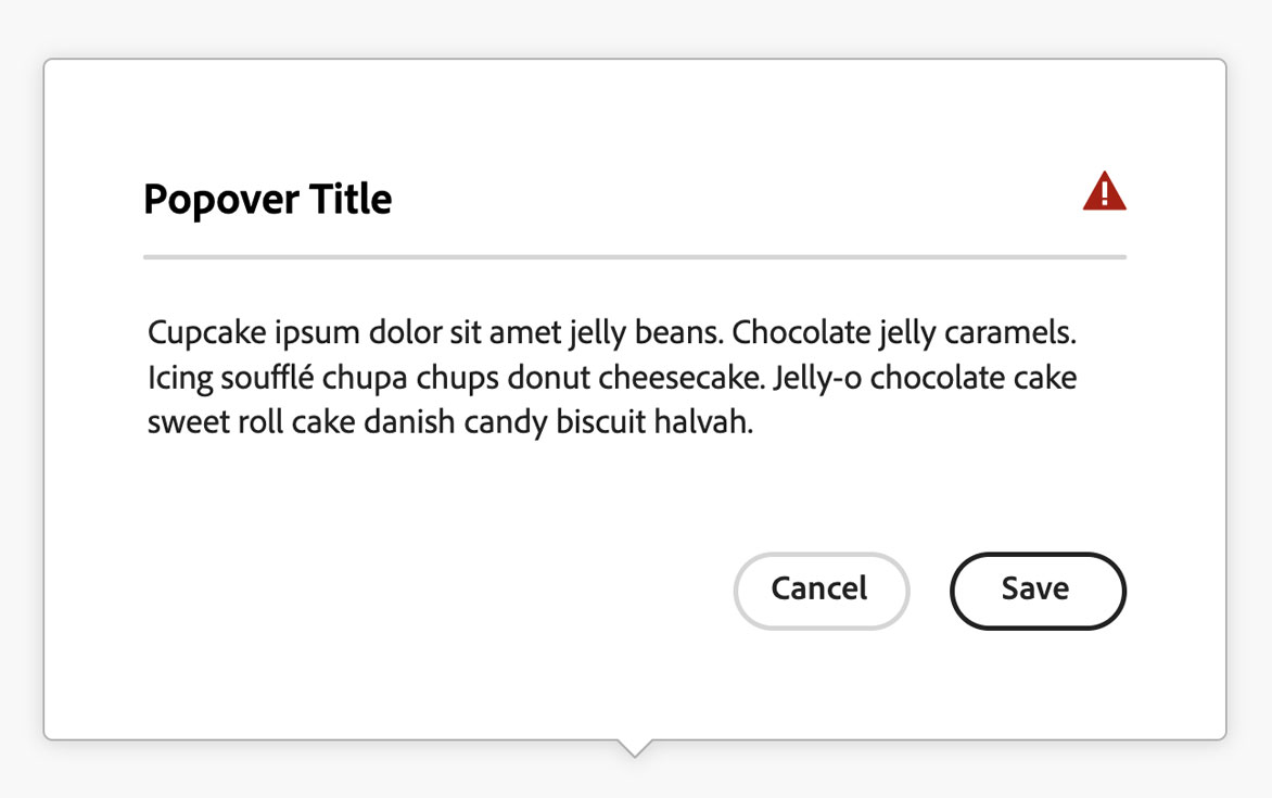
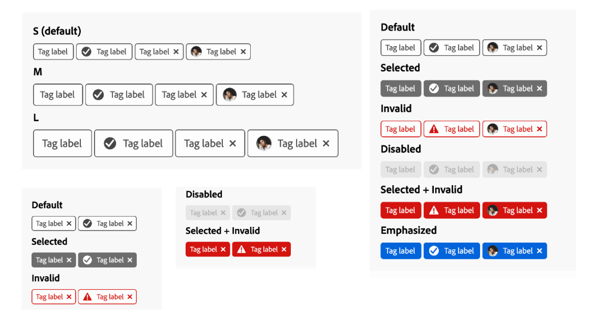
Popover
Migration of popover required the addition of 22 position variants, 10 of which made use of logical properties. The triangular tip which points to the source of the popover needed to be positioned and rotated precisely for each popover position, and overridden for right-to-left languages for the 10 logical positions.
Codepens
Popover CSS
/*Copyright 2022 Adobe. All rights reserved.This file is licensed to you under the Apache License, Version 2.0 (the "License");you may not use this file except in compliance with the License. You may obtain a copyof the License at http://www.apache.org/licenses/LICENSE-2.0Unless required by applicable law or agreed to in writing, software distributed underthe License is distributed on an "AS IS" BASIS, WITHOUT WARRANTIES OR REPRESENTATIONSOF ANY KIND, either express or implied. See the License for the specific languagegoverning permissions and limitations under the License.*/@import "../commons/overlay-coretokens.css";.spectrum-Popover {--spectrum-popover-cross-offset: 0; /* change to offset from source, default is 0 */--spectrum-popover-background-color: var(--spectrum-background-layer-2-color);--spectrum-popover-border-color: var(--spectrum-gray-400);/* popover inner padding */--spectrum-popover-content-area-spacing-vertical: var(--spectrum-popover-top-to-content-area);/* popover drop shadow */--spectrum-popover-shadow-horizontal: var(--spectrum-drop-shadow-x);--spectrum-popover-shadow-vertical: var(--spectrum-drop-shadow-y);--spectrum-popover-shadow-blur: var(--spectrum-drop-shadow-blur);--spectrum-popover-shadow-color: var(--spectrum-drop-shadow-color);/* popover corner radius */--spectrum-popover-corner-radius: var(--spectrum-corner-radius-100);/* pointer tip dimensions */--spectrum-popover-pointer-width: var(--spectrum-popover-tip-width);--spectrum-popover-pointer-height: var(--spectrum-popover-tip-height);/* pointer tip - default spacing to edge - corner radius plus half of tip width to neutralize override */--spectrum-popover-pointer-edge-offset: calc(var(--spectrum-corner-radius-100) + (var(--spectrum-popover-tip-width) / 2));/* pointer tip - spacing to edge will center pointer to source - apply in markup by setting '--spectrum-popover-pointer-edge-offset' value == half of source */--spectrum-popover-pointer-edge-spacing: calc(var(--spectrum-popover-pointer-edge-offset) - (var(--spectrum-popover-tip-width) / 2));}/* windows high contrast mode */@media (forced-colors: active) {.spectrum-Popover {--highcontrast-popover-border-color: CanvasText;}}.spectrum-Popover {@inherit: %spectrum-overlay;box-sizing: border-box;position: absolute;outline: none; /* Hide focus outline */padding: var(--mod-popover-content-area-spacing-vertical, var(--spectrum-popover-content-area-spacing-vertical)) 0;display: inline-flex;flex-direction: column;border-style: solid;border-radius: var(--mod-popover-corner-radius, var(--spectrum-popover-corner-radius));border-color: var(--highcontrast-popover-border-color, var(--mod-popover-border-color, var(--spectrum-popover-border-color)));border-width: var(--mod-popover-border-width, var(--spectrum-popover-border-width));background-color: var(--mod-popover-background-color, var(--spectrum-popover-background-color));filter: drop-shadow(var(--mod-popover-shadow-horizontal, var(--spectrum-popover-shadow-horizontal)) var(--mod-popover-shadow-vertical, var(--spectrum-popover-shadow-vertical)) var(--mod-popover-shadow-blur, var(--spectrum-popover-shadow-blur)) var(--mod-popover-shadow-color, var(--spectrum-popover-shadow-color)));/* default opens and animates upward */&.is-open {@inherit: %spectrum-overlay--open;}/* has tip triangle */&.spectrum-Popover--withTip {.spectrum-Popover-tip {/* triangle polygon */.spectrum-Popover-tip-triangle {stroke-linecap: square;stroke-linejoin: miter;fill: var(--mod-popover-background-color, var(--spectrum-popover-background-color));stroke: var(--mod-popover-border-color, var(--spectrum-popover-border-color));stroke-width: var(--mod-popover-border-width, var(--spectrum-popover-border-width));}}}}/* position naming - first position term is popover position, second term is source position *//* example: --top-left = popover is to top and source is to left *//* popover position is at top of source - default placement */.spectrum-Popover--top,.spectrum-Popover--top-left,.spectrum-Popover--top-right,.spectrum-Popover--top-start,.spectrum-Popover--top-end {margin-bottom: var(--spectrum-popover-cross-offset);/* popover animates upward ⬆ */&.is-open {@inherit: %spectrum-overlay--top--open;}}/* popover position is at bottom of source */.spectrum-Popover--bottom,.spectrum-Popover--bottom-left,.spectrum-Popover--bottom-right,.spectrum-Popover--bottom-start,.spectrum-Popover--bottom-end {margin-top: var(--spectrum-popover-cross-offset);/* popover animates downward ⬇ */&.is-open {@inherit: %spectrum-overlay--bottom--open;}}/* popover position is right of source */.spectrum-Popover--right,.spectrum-Popover--right-bottom,.spectrum-Popover--right-top {margin-left: var(--spectrum-popover-cross-offset);/* popover animates towards right ⮕ */&.is-open {@inherit: %spectrum-overlay--right--open;}}/* popover position is left of source */.spectrum-Popover--left,.spectrum-Popover--left-bottom,.spectrum-Popover--left-top {margin-right: var(--spectrum-popover-cross-offset);/* popover animates towards left ⬅ */&.is-open {@inherit: %spectrum-overlay--left--open;}}/* logical property - popover is horizontally at start */.spectrum-Popover--start,.spectrum-Popover--start-top,.spectrum-Popover--start-bottom {margin-inline-end: var(--spectrum-popover-cross-offset);/* LTR read, popover animates towards left ⬅ */&.is-open {@inherit: %spectrum-overlay--left--open;}/* RTL read, popover animates towards right ⮕ */[dir="rtl"] & {&.is-open {@inherit: %spectrum-overlay--right--open;}}}/* logical property - popover is horizontally at end */.spectrum-Popover--end,.spectrum-Popover--end-top,.spectrum-Popover--end-bottom {margin-inline-start: var(--spectrum-popover-cross-offset);/* LTR read, popover animates towards right ⮕ */&.is-open {@inherit: %spectrum-overlay--right--open;}/* RTL read, popover animates towards left ⬅ */[dir="rtl"] & {&.is-open {@inherit: %spectrum-overlay--left--open;}}}/* HAS TIP - popover with triangle pointer *//* default, top, and bottom position tip - tip defaults to pointing down ▽ */.spectrum-Popover--withTip {&.spectrum-Popover,&.spectrum-Popover--top,&.spectrum-Popover--top-left,&.spectrum-Popover--top-right,&.spectrum-Popover--top-start,&.spectrum-Popover--top-end,&.spectrum-Popover--bottom,&.spectrum-Popover--bottom-left,&.spectrum-Popover--bottom-right,&.spectrum-Popover--bottom-start,&.spectrum-Popover--bottom-end {.spectrum-Popover-tip {width: var(--mod-popover-pointer-width, var(--spectrum-popover-pointer-width));height: var(--mod-popover-pointer-height, var(--spectrum-popover-pointer-height));position: absolute;top: 100%;left: 0;right: 0;margin: auto;/* https://stackoverflow.com/questions/44170229/how-to-prevent-half-pixel-svg-shift-on-high-pixel-ratio-devices-retina */transform: translate(0, 0);}}/* popover is at top of source, tip left and pointing down ▽ */&.spectrum-Popover--top-left {.spectrum-Popover-tip {left: var(--mod-popover-pointer-edge-spacing, var(--spectrum-popover-pointer-edge-spacing));right: auto;}}/* popover is at top of source, tip right and pointing down ▽ */&.spectrum-Popover--top-right {.spectrum-Popover-tip {left: auto;right: var(--mod-popover-pointer-edge-spacing, var(--spectrum-popover-pointer-edge-spacing));}}/* logical property - popover is above, source and tip are at start, tip pointing down ▽ */&.spectrum-Popover--top-start {.spectrum-Popover-tip {margin-inline-start: var(--mod-popover-pointer-edge-spacing, var(--spectrum-popover-pointer-edge-spacing));}}/* logical property - popover is above, source and tip are at end, tip pointing down ▽ */&.spectrum-Popover--top-end {.spectrum-Popover-tip {margin-inline-end: var(--mod-popover-pointer-edge-spacing, var(--spectrum-popover-pointer-edge-spacing));}}/* popover position is bottom of source with tip pointing up △ */&.spectrum-Popover--bottom,&.spectrum-Popover--bottom-left,&.spectrum-Popover--bottom-right,&.spectrum-Popover--bottom-start,&.spectrum-Popover--bottom-end {.spectrum-Popover-tip {top: auto;bottom: 100%;/* flip triangle to face up */transform: scaleY(-1);}}/* popover position is bottom, source is at left, tip pointing up △ */&.spectrum-Popover--bottom-left {.spectrum-Popover-tip {left: var(--mod-popover-pointer-edge-spacing, var(--spectrum-popover-pointer-edge-spacing));right: auto;}}/* popover position is bottom, source is at right, tip pointing up △ */&.spectrum-Popover--bottom-right {.spectrum-Popover-tip {left: auto;right: var(--mod-popover-pointer-edge-spacing, var(--spectrum-popover-pointer-edge-spacing));}}/* logical property - popover is below, source is at start, tip pointing up △ */&.spectrum-Popover--bottom-start {.spectrum-Popover-tip {margin-inline-start: var(--mod-popover-pointer-edge-spacing, var(--spectrum-popover-pointer-edge-spacing));}}/* logical property - popover is below, source is at end, tip pointing up △ */&.spectrum-Popover--bottom-end {.spectrum-Popover-tip {margin-inline-end: var(--mod-popover-pointer-edge-spacing, var(--spectrum-popover-pointer-edge-spacing));}}/* right, left start, end popover position with tip default to pointing right ▷ */&.spectrum-Popover--left,&.spectrum-Popover--left-bottom,&.spectrum-Popover--left-top,&.spectrum-Popover--right,&.spectrum-Popover--right-bottom,&.spectrum-Popover--right-top,&.spectrum-Popover--start,&.spectrum-Popover--start-top,&.spectrum-Popover--start-bottom,&.spectrum-Popover--end,&.spectrum-Popover--end-top,&.spectrum-Popover--end-bottom {.spectrum-Popover-tip {/* swap height and width for vertical triangle */width: var(--mod-popover-pointer-height, var(--spectrum-popover-pointer-height));height: var(--mod-popover-pointer-width, var(--spectrum-popover-pointer-width));top: 0;bottom: 0;}/* left popover with tip pointing right ▷ */&.spectrum-Popover--left,&.spectrum-Popover--left-bottom,&.spectrum-Popover--left-top {.spectrum-Popover-tip {left: 100%;right: auto;}}/* right popover with tip pointing left ◁ */&.spectrum-Popover--right,&.spectrum-Popover--right-bottom,&.spectrum-Popover--right-top {.spectrum-Popover-tip {right: 100%;left: auto;/* flip tip to point left ◁ */transform: scaleX(-1);}}/* popover with tip at top */&.spectrum-Popover--right-top,&.spectrum-Popover--left-top,&.spectrum-Popover--start-top,&.spectrum-Popover--end-top {.spectrum-Popover-tip {top: var(--mod-popover-pointer-edge-spacing, var(--spectrum-popover-pointer-edge-spacing));bottom: auto;}}/* popover with tip at bottom */&.spectrum-Popover--right-bottom,&.spectrum-Popover--left-bottom,&.spectrum-Popover--start-bottom,&.spectrum-Popover--end-bottom {.spectrum-Popover-tip {top: auto;bottom: var(--mod-popover-pointer-edge-spacing, var(--spectrum-popover-pointer-edge-spacing));}}}/* logical property - start popover position with tip pointing toward end - LTR default is ▷ */&.spectrum-Popover--start,&.spectrum-Popover--start-top,&.spectrum-Popover--start-bottom {.spectrum-Popover-tip {margin-inline-start: 100%;[dir="rtl"] & {transform: none;/* flip tip to point left ◁ */transform: scaleX(-1);}}}/* logical property - end popover position with tip pointing toward start - LTR default is ◁ **/&.spectrum-Popover--end,&.spectrum-Popover--end-top,&.spectrum-Popover--end-bottom {/* tip triangle */.spectrum-Popover-tip {margin-inline-end: 100%;/* flip tip to point right ▷ */transform: scaleX(-1);[dir="rtl"] & {/* flip tip to point left ◁ */transform: scaleX(1);}}}}
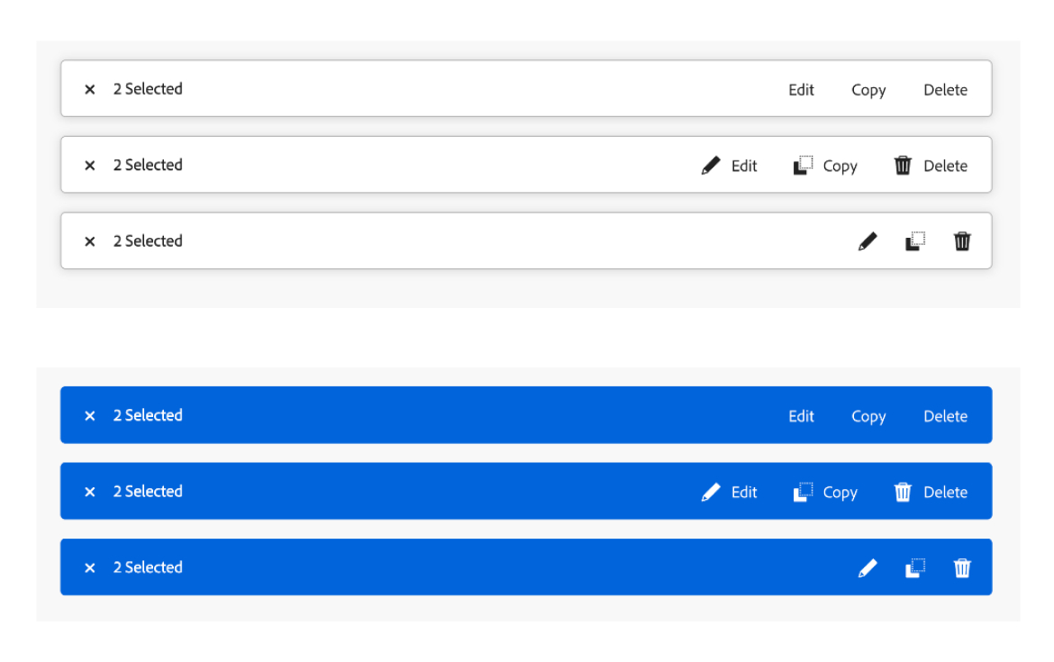
Action Bar
One of the more complex components, action bar imports several child components which must be positioned precisely without conflicting with the style guidelines of each child.
Actionbar CSS
/*Copyright 2022 Adobe. All rights reserved.This file is licensed to you under the Apache License, Version 2.0 (the "License");you may not use this file except in compliance with the License. You may obtain a copyof the License at http://www.apache.org/licenses/LICENSE-2.0Unless required by applicable law or agreed to in writing, software distributed underthe License is distributed on an "AS IS" BASIS, WITHOUT WARRANTIES OR REPRESENTATIONSOF ANY KIND, either express or implied. See the License for the specific languagegoverning permissions and limitations under the License.*/.spectrum-ActionBar {--spectrum-actionbar-height: var(--spectrum-action-bar-height);--spectrum-actionbar-corner-radius: var(--spectrum-corner-radius-100);/* item counter field label */--spectrum-actionbar-item-counter-font-size: var(--spectrum-font-size-100);--spectrum-actionbar-item-counter-line-height: var(--spectrum-line-height-100);--spectrum-actionbar-item-counter-color: var(--spectrum-neutral-content-color-default);/* cjk language support for item counter */&:lang(ja),&:lang(zh),&:lang(ko) {--spectrum-actionbar-item-counter-line-height-cjk: var(--spectrum-cjk-line-height-100);}/* colors - applied to popover */--spectrum-actionbar-popover-background-color: var(--spectrum-gray-50);--spectrum-actionbar-popover-border-color: var(--spectrum-gray-400);/* emphasized variation colors */--spectrum-actionbar-emphasized-background-color: var(--spectrum-informative-background-color-default);--spectrum-actionbar-emphasized-item-counter-color: var(--spectrum-white);/* spacing of action bar bottom and horizontal outer edge */--spectrum-actionbar-spacing-outer-edge: var(--spectrum-spacing-300);/* spacing of close button */--spectrum-actionbar-spacing-close-button-top: var(--spectrum-spacing-100);--spectrum-actionbar-spacing-close-button-start: var(--spectrum-spacing-100);--spectrum-actionbar-spacing-close-button-end: var(--spectrum-spacing-75);/* spacing of item counter field label */--spectrum-actionbar-spacing-item-counter-top: var(--spectrum-action-bar-top-to-item-counter);--spectrum-actionbar-spacing-item-counter-end: var(--spectrum-spacing-400);/* spacing of action group */--spectrum-actionbar-spacing-action-group-top: var(--spectrum-spacing-100);--spectrum-actionbar-spacing-action-group-end: var(--spectrum-spacing-100);/* drop shadow */--spectrum-actionbar-shadow-horizontal: var(--spectrum-drop-shadow-x);--spectrum-actionbar-shadow-vertical: var(--spectrum-drop-shadow-y);--spectrum-actionbar-shadow-blur: var(--spectrum-drop-shadow-blur);--spectrum-actionbar-shadow-color: var(--spectrum-drop-shadow-color);}/* windows high contrast mode */@media (forced-colors: active) {.spectrum-ActionBar {--highcontrast-actionbar-popover-border-color: CanvasText;}.spectrum-ActionBar--emphasized {.spectrum-ActionBar-popover {--highcontrast-actionbar-popover-border-color: CanvasText;}}}/* ActionBar is outer wrapper with nested popover component within */.spectrum-ActionBar {/* creates horizontal spacing to edge */padding: 0 var(--mod-actionbar-spacing-outer-edge, var(--spectrum-actionbar-spacing-outer-edge));inset-block-end: 0;z-index: 1;/* Account for fixed width */box-sizing: border-box;/* Let clicks in blank space fall through */pointer-events: none;/* Take up no space and be invisible when not open */block-size: 0;opacity: 0;&.is-open {/* add ActionBar bottom margin to height for correct spacing even when sticky */block-size: calc(var(--mod-actionbar-spacing-outer-edge, var(--spectrum-actionbar-spacing-outer-edge)) + var(--mod-actionbar-height, var(--spectrum-actionbar-height)));opacity: 1;}.spectrum-ActionBar-popover {/* popover is ActionBar height */block-size: var(--mod-actionbar-height, var(--spectrum-actionbar-height));box-sizing: border-box;inline-size: 100%;margin: auto;padding-block-start: 0;padding-block-end: 0;/* Be relative so our width can be restricted */position: relative;border-radius: var(--mod-actionbar-corner-radius, var(--spectrum-actionbar-corner-radius));border-color: var(--highcontrast-actionbar-popover-border-color, var(--mod-actionbar-popover-border-color, var(--spectrum-actionbar-popover-border-color)));background-color: var(--mod-actionbar-popover-background-color, var(--spectrum-actionbar-popover-background-color));filter: drop-shadow(var(--mod-actionbar-shadow-horizontal, var(--spectrum-actionbar-shadow-horizontal)) var(--mod-actionbar-shadow-vertical, var(--spectrum-actionbar-shadow-vertical)) var(--mod-actionbar-shadow-blur, var(--spectrum-actionbar-shadow-blur)) var(--mod-actionbar-shadow-color, var(--spectrum-actionbar-shadow-color)));/* Let clicks do their thing */pointer-events: auto;/* inner layout of content items */display: flex;flex-direction: row;}/* close button */.spectrum-CloseButton {margin-inline-start: var(--mod-actionbar-spacing-close-button-start, var(--spectrum-actionbar-spacing-close-button-start));margin-inline-end: var(--mod-actionbar-spacing-close-button-end, var(--spectrum-actionbar-spacing-close-button-end));margin-block-start: var(--mod-actionbar-spacing-close-button-top, var(--spectrum-actionbar-spacing-close-button-top));flex-shrink: 0;}/* item counter */.spectrum-FieldLabel {margin-inline-end: var(--mod-actionbar-spacing-item-counter-end, var(--spectrum-actionbar-spacing-item-counter-end));margin-block-start: var(--mod-actionbar-spacing-item-counter-top, var(--spectrum-actionbar-spacing-item-counter-top));/* neutralize padding for correct spacing within ActionBar */padding: 0;font-size: var(--mod-actionbar-item-counter-font-size, var(--spectrum-actionbar-item-counter-font-size));color: var(--mod-actionbar-item-counter-color, var(--spectrum-actionbar-item-counter-color));line-height: var(--mod-actionbar-item-counter-line-height, var(--spectrum-actionbar-item-counter-line-height));/* cjk language support */&:lang(ja),&:lang(zh),&:lang(ko) {line-height: var(--mod-actionbar-item-counter-line-height-cjk, var(--spectrum-actionbar-item-counter-line-height-cjk));}}/* action group */.spectrum-ActionGroup {margin-inline-end: var(--mod-actionbar-spacing-action-group-end, var(--spectrum-actionbar-spacing-action-group-end));margin-block-start: var(--mod-actionbar-spacing-action-group-top, var(--spectrum-actionbar-spacing-action-group-top));/* align to end by default */margin-inline-start: auto;}}.spectrum-ActionBar--emphasized {.spectrum-ActionBar-popover {filter: none;background-color: var(--mod-actionbar-emphasized-background-color, var(--spectrum-actionbar-emphasized-background-color));/* border transparent instead of none so WHCM will have visible border */border-color: transparent;}/* ensure text is legible on emphasized background */.spectrum-FieldLabel {color: var(--mod-actionbar-emphasized-item-counter-color, var(--spectrum-actionbar-emphasized-item-counter-color));}}.spectrum-ActionBar--sticky {inset-inline-start: 0;inset-inline-end: 0;position: sticky;}.spectrum-ActionBar--fixed {position: fixed;}/* flexible width */.spectrum-ActionBar--flexible {.spectrum-ActionBar-popover {inline-size: auto;}}
More Components I Worked On
My Adobe Pull Requests
Puzzles of Note
Project Puzzle: Windows High Contrast Mode
Adobe's design system supports Windows High Contrast Mode. Our team was working on Apple machines, so our testing capabilities for this were limited to Chrome's browser emulation. Design specs for WHCM were provided with the appearance of Chrome's emulation of forced-colors: active combined with prefers-color-scheme: dark, so we used that combination as our standard for this test.
High Contrast Keywords
High-contrast mode utilizes a collection of keywords which can be applied to override specific component custom properties. This can give us more accessible results.
- Highlight
- HighlightText
- CanvasText
- GrayText
- ButtonText
- ButtonFace
- LinkText
- Canvas
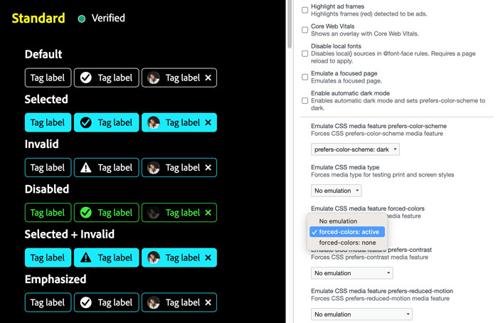
We conducted initial high contrast mode testing using Chrome's emulation tools.
Testing Tool for High-Contrast Mode
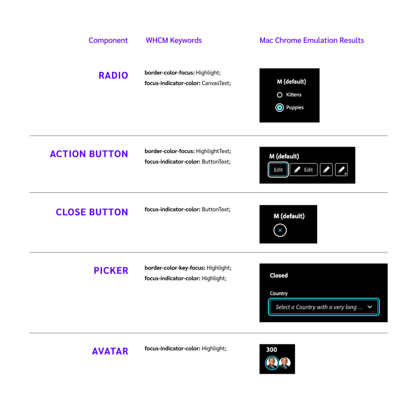
I created an HTML document to test how these keywords look when applied as background color, border color, and text color. I asked team mates to view this on a PC and provide screenshots. I later obtained access to an Assistiv Labs emulator for more extensive testing.

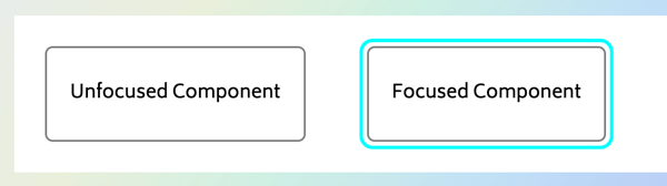
High Contrast Mode and Focus States
While reviewing a PR, I became concerned that we may choose inconsistent keywords for focus states, which are particularly important for people navigating with a keyboard. Not everyone uses a mouse. If the focus state looks different for each component, it can be difficult for a keyboard user to know what they are focused on.
I consulted with Adobe's accessibility experts, using the testing document I'd created. I then built a new HTML testing document to test focus states specifically. We agreed on standardizing our color keywords for a component's focused border color (if it has a border) and the focus indicator border color and we chose keywords for these.
I created a visual comparison to demonstrate that some components had inconsistent focus appearance in high contrast mode.
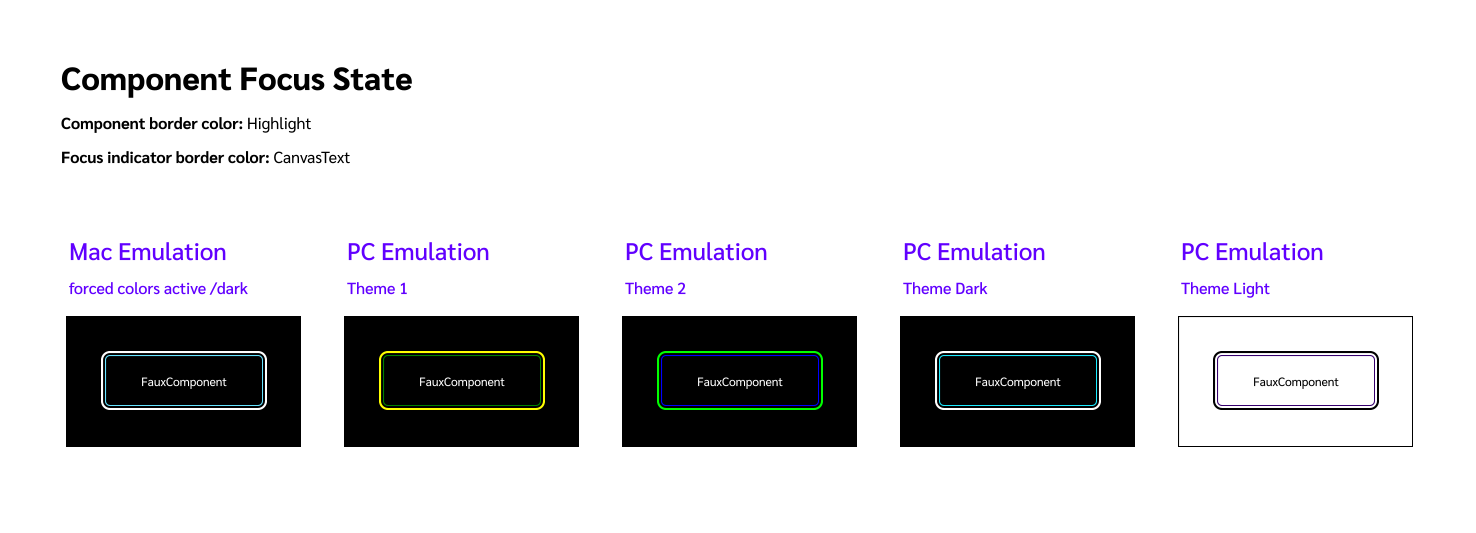
I created this document to confirm our standard high-contrast focus state selections and help build consensus about the choices.
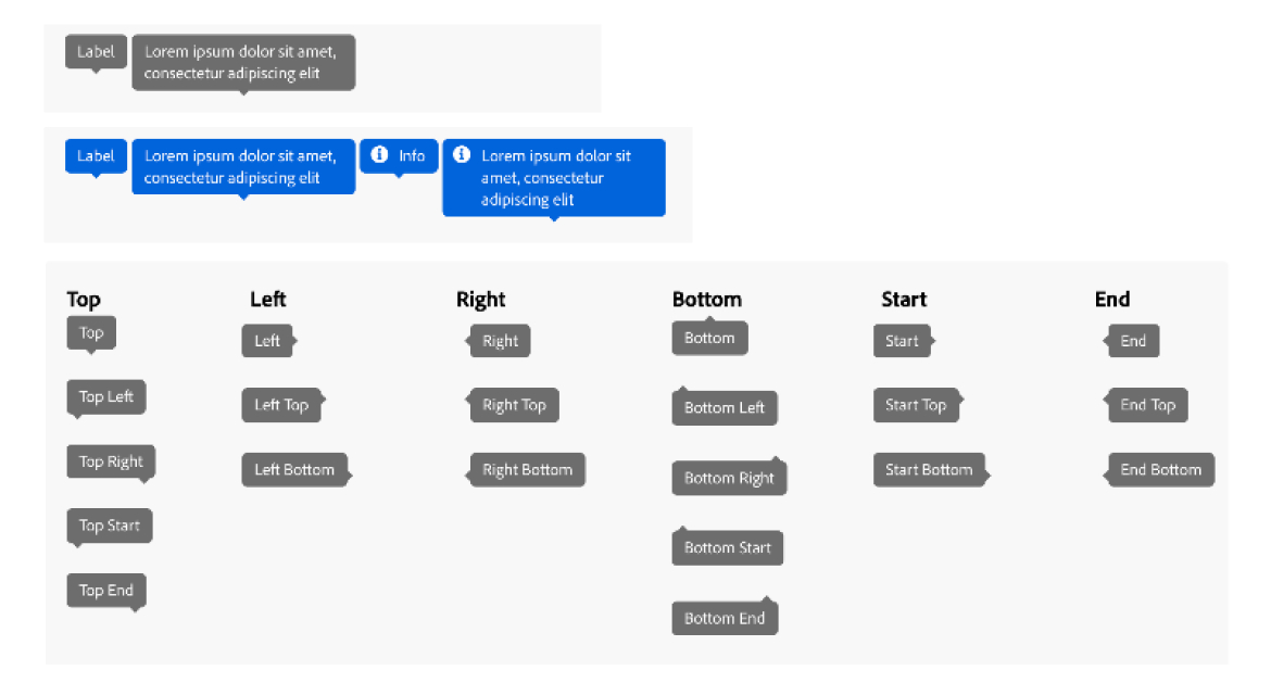
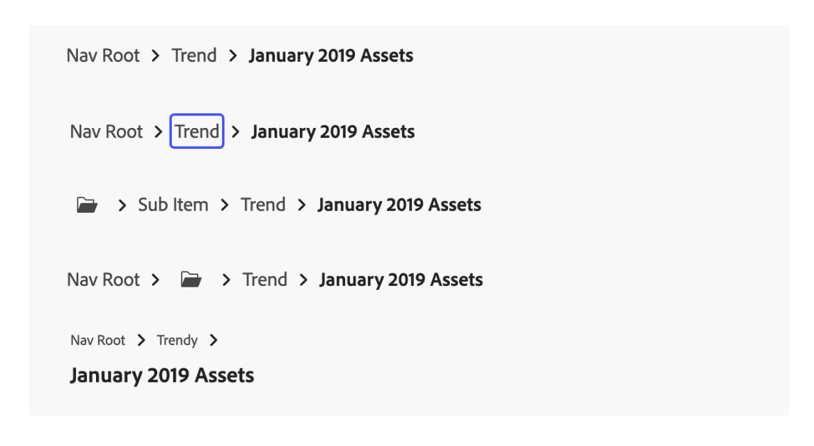
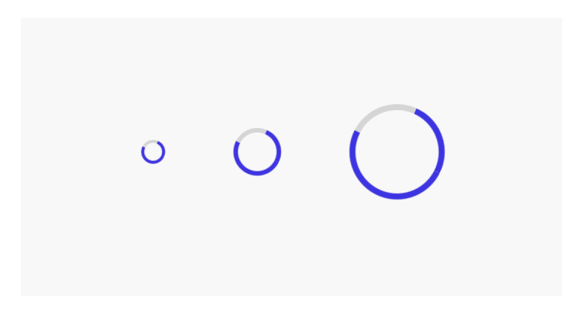
Project Puzzle: Logical Properties
Using logical properties when positioning elements allows the system to support languages that are read right-to-left and top-to-bottom. Logical properties relate to the "start" and "end" of an element rather than left/right/top/bottom, allowing us to align and order our elements in a way that makes sense for a given language.
Logical properties can help make the web more inclusive.
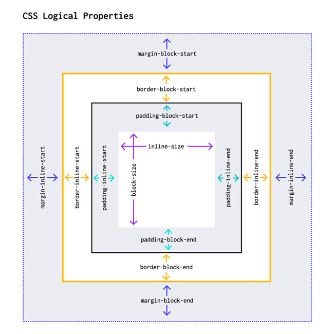
I was new to using logical properties on this project, so I created this diagram as a personal learning tool.
Project Puzzle: Focus Indicator Border Radius
This puzzle was a fun one. We needed to build focus indicators for these components. We had custom properties dictating component border width, border radius, the gap between the component border and the focus indicator border, and focus indicator border thickness.
We needed the border radius of the focus indicator to hug the component. Using the same border radius doesn't work, and we wanted this to to be Adobe quality, so it had to match perfectly. So we used a calc that goes a little like this:
border-radius: calc(#{$border-radius-component} + #{$gap-focus-ring} + #{$border-width-component});
...in other words,
border-radius: calc(component-border-radius + focus-indicator-gap + component-border-width);
I built an imaginary component to demonstrate how to relate border radii as well as logical positioning of a focus indicator in relation to a component.
View the Codepen for This Puzzle
See the Pen Border Radius and Focus Ring Alignment - Adobe UI by Monet (@mfort) on CodePen.
Adobe Codepens
Using Codepen to Communicate and Collaborate
I used codepen extensively to solve problems I encountered on Adobe's components. View the collection: