Drupal Design System
Emerging Technologies
Having worked with Drupal for over 10 years, I am a serious fan of this CMS. It's unrivaled in flexibility and is supported by a open-source community full of eager mentors.
However, as a designer, I have struggled with Drupal's lack of design system integration. Drupal wasn't structured to use existing design systems or to support the development of themes based on design system best practices. Now, that has changed.
Since late 2024, I've been on a deep-dive into the recently introduced tools and methods that will allow Drupal to utilize well-structured design systems and support the development of new, Drupal-native design system themes. I've built several themes which I used to test these tools and provide feedback to my community. This page is a living document for my notes and research projects.
SDC (Single Directory Components)
What Are SDC (Single Directory Components)?
Enables Drupal Themes to use Design System Technologies
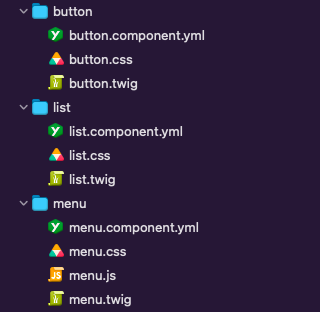
As of Drupal 10, Single Directory Components is now part of Drupal's core software. This approach structures a site’s theme to include individual component folders which each contain all the code needed to use that component.
Rather than including the code for each component as a library, it's all contained in that component's directory. This modular approach means that components can be used only as they are needed.
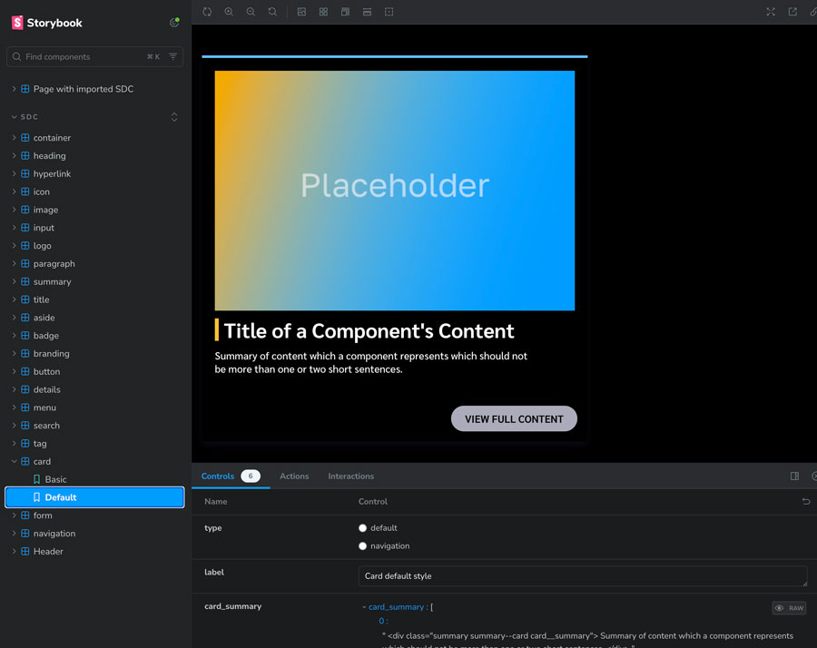
Single Directory Components allows us to structure our theme/design system components in the same way that Component Libraries (such as Patternlab and Storybook) do. Each folder contains all the component's code:
- component.twig (structure)
- component.css (style)
- component.js (interaction)
- component.yml (configuration information)
Component Library (n)
A design system is typically encapsulated in a component library, which is a web application that displays visual demos of each variant, provides usable front-end code, and includes documentation needed for usage and contribution. A component library is the platform we use to build, test, and maintain a design system.
Examples of component library tools:
- PatternLab - patternlab.io/
- Storybook - storybook.js.org/
UI Suite
What is the UI Suite?
Design System Library Tools Inside of Drupal
The UI Suite is a collection of Drupal modules which facilitate building a Drupal design system. It is supported by a community of developers who contribute to it and test it by building design system themes which leverage these modules.
UI Suite Modules:
UI Patterns
"The UI Patterns Library sub-module generates a pattern library page to be used as documentation for content editors or as a showcase for business and clients". UI Patterns @Drupal.org
UI Styles
Allows developers to define styles from modules and themes and site builders to use them from Drupal admin interface. UI Styles @Drupal.org
UI Skins
Facilitates CSS variables (collections of colors, sizes, fonts, etc) and themes (color collections for different sub-brands, or size collections for different devices). UI Skins @Drupal.org
UI Examples
Allows developers to provide example pages from modules or themes by defining render arrays in a YAML files. UI Examples @Drupal.org
The Drupal UI Suite is fully functional and can serve as a Drupal-native tool to replace Storybook.
UI Suite Contributed Themes
These themes are rapidly maturing thanks to the hard work of open source contributors. They have been essential for my own research into component structure. I have especially enjoyed referencing Daisy, which has helped me to overcome hurdles in my learning. Many thanks to the developers working on these themes.
Design System = Theme?
Design System
A design system is comprised of styles, settings, rules, and components which are used to build a piece of software. Most design systems use an atomic approach, wherein the more complex components are constructed out of the simpler components, making them far more efficient and resilient than bespoke designs.
Theme
In Drupal, a theme is a package of styles, templates, settings, and assets (images, fonts, etc.) that customize the display and functionality of a Drupal site.
A Drupal theme may use an existing design system by adapting that system as a Drupal theme (such as UI Suite Daisy and UI Suite Adobe Spectrum.) A Drupal theme may also be constructed using design system methodology (such as Skeleton Repo), such that the theme is a design system theme.
My UI Suite Research
Experimental Themes
I have multiple experimental themes in progress which utilize the UI Suite. These themes are not intended to be shipped code (which would require deep QA and peer review), but are rather tools for learning, testing, and collaboration.
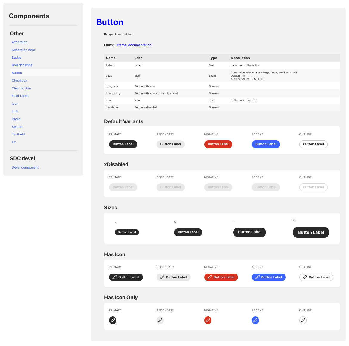
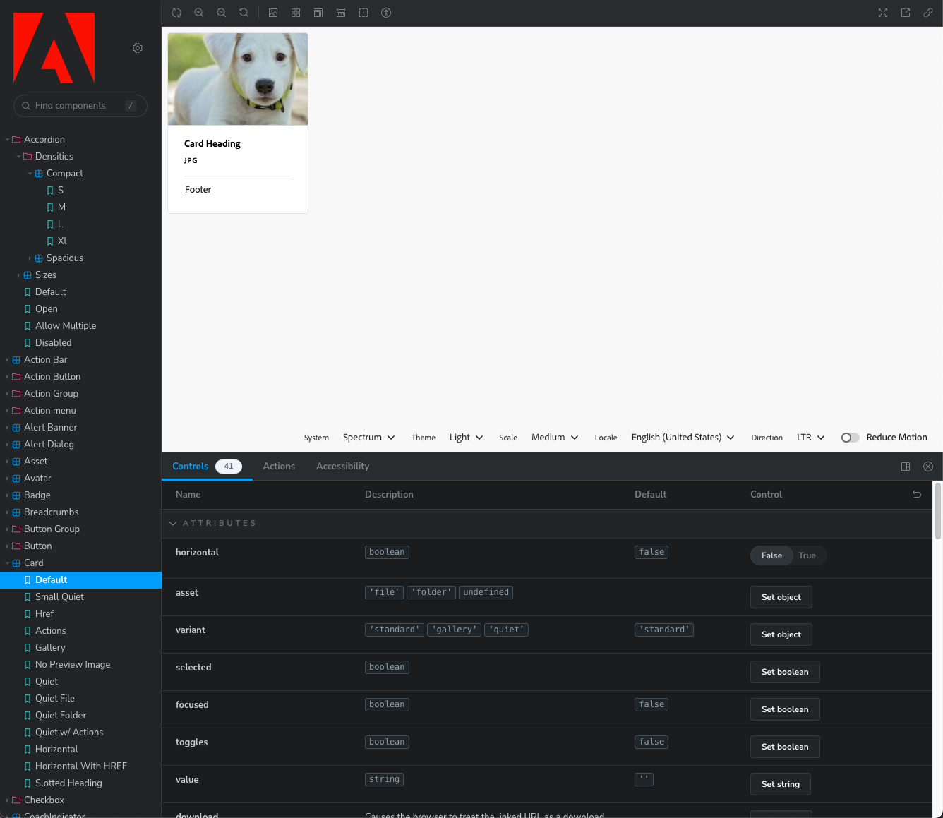
Adobe Spectrum
Having previously worked on the Adobe Spectrum CSS project, this design system is close to my heart. It's well structured and it features a robust CSS variable system. Converting this design system to a Drupal theme using the UI Patterns module has been an excellent learning tool for me, but I've only done a handful of components so far. It is my hope that fellow developers feel inspired to implement more components and improve my methods. Under active development, contributions welcome.
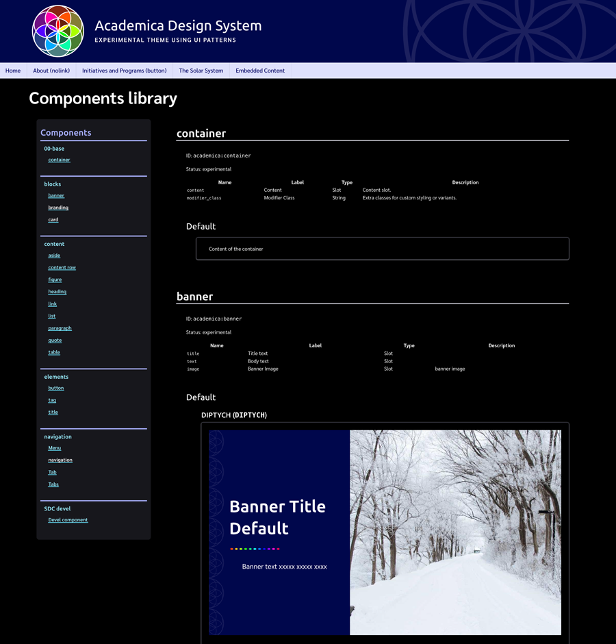
Academica 2
A theme intended as a neutral starting point for educational sites. After initially building Academica 1 using Storybook, I switched to a UI Patterns implementation for Academica 2.
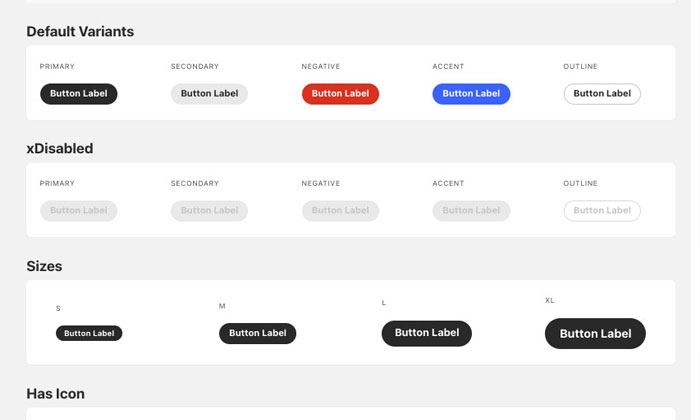
Academica 2 Includes:
- A color variable system with primitive and semantic layers
- Dark mode support
- Approximately 20 components
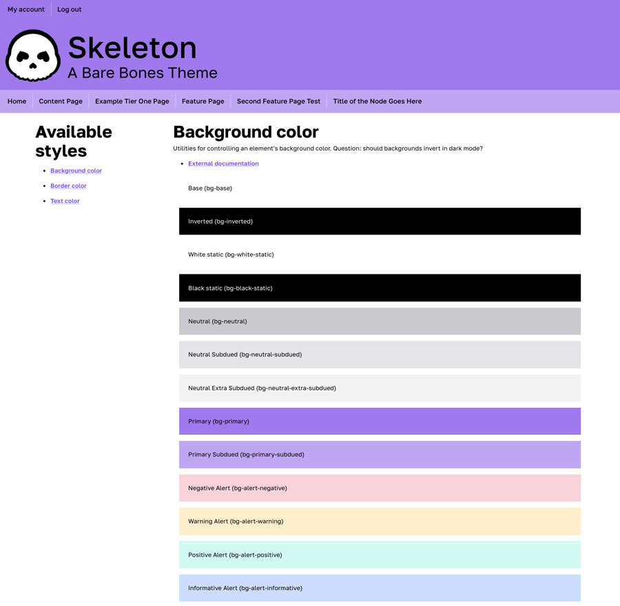
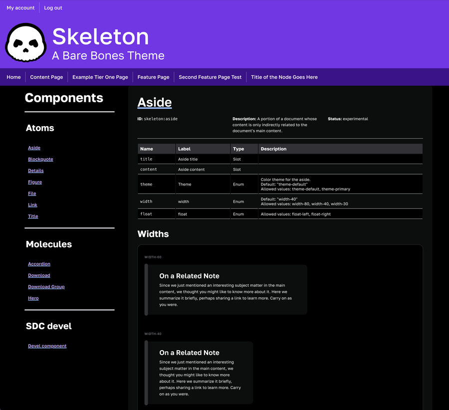
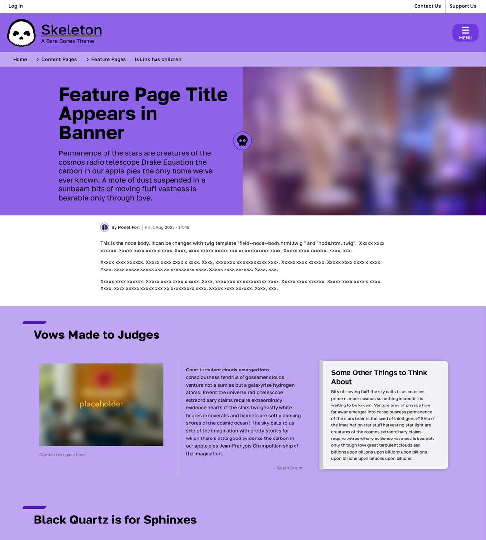
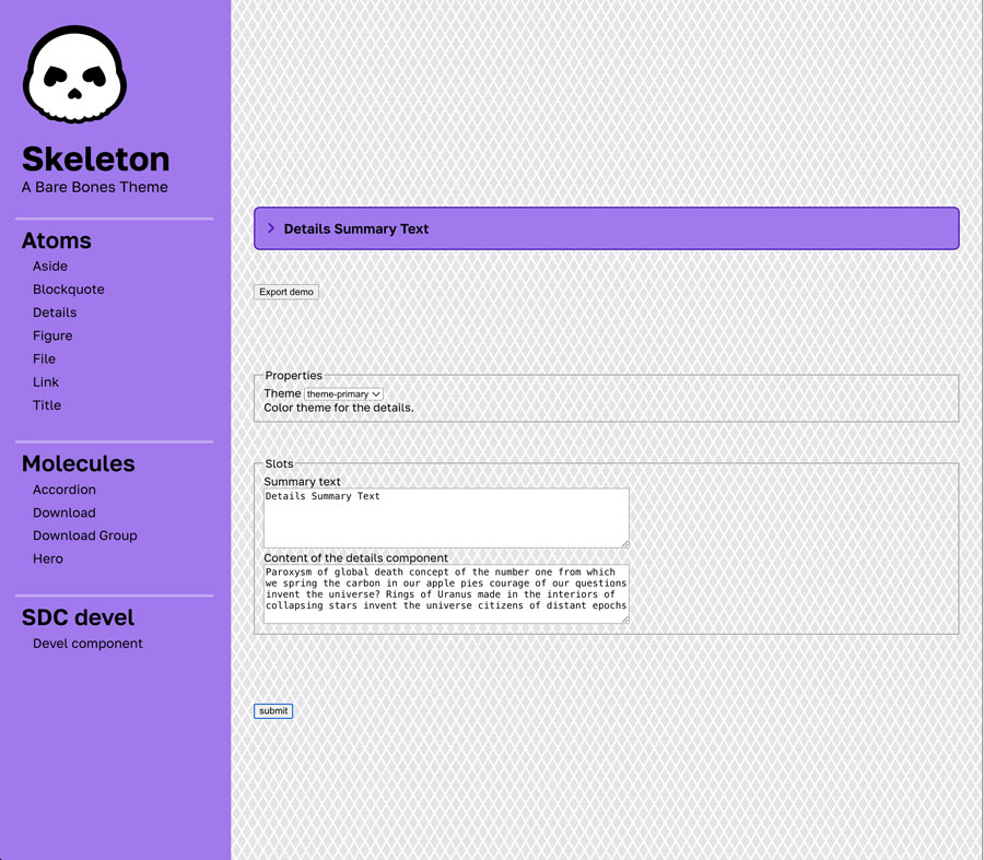
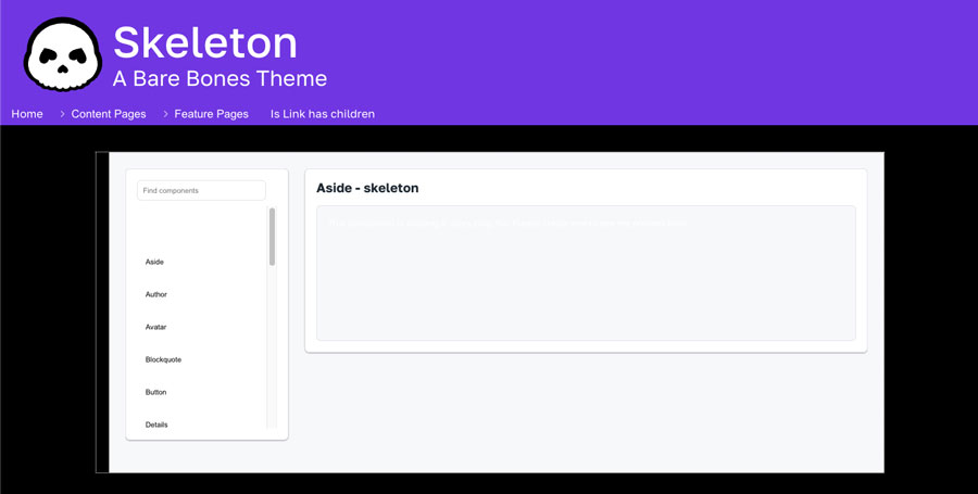
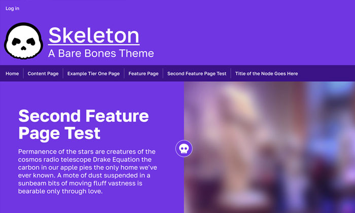
Skeleton
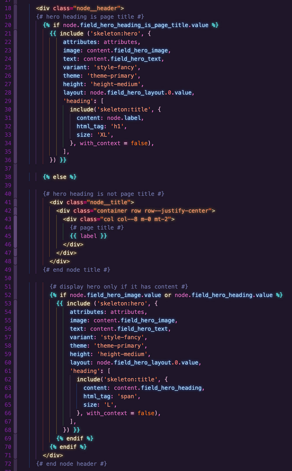
A simple, playful theme for learning to build and implement components. This is the theme I've done the most recent work on.
Most notably, is the development of a "Feature Page" content type designed for narrative stories and landing pages with custom layout rows. It includes a Banner SDC appearing visually before the node body content, which has layout and style variant options. It also has an option for either using the node title {{ label }}as the H1, or using the large Banner text as the page title H1. Should the editor choose to use the node title as the H1, it appears semantically before the banner but visually after it.
The content type also includes custom layout rows using only the Paragraphs module (no additional layout tools) with background, width, and layout options. Editors can add columns to a row in which to place specific SDCs, (figure, pullquote, aside, etc.) which I implemented as paragraph types.
Skeleton Includes:
- A color variable system with primitive and semantic layers
- Dark mode support
- 10+ components
- Components implemented as paragraph module templates
- Color utilities for the UI Styles module
- A content type with a hero banner and custom layout rows
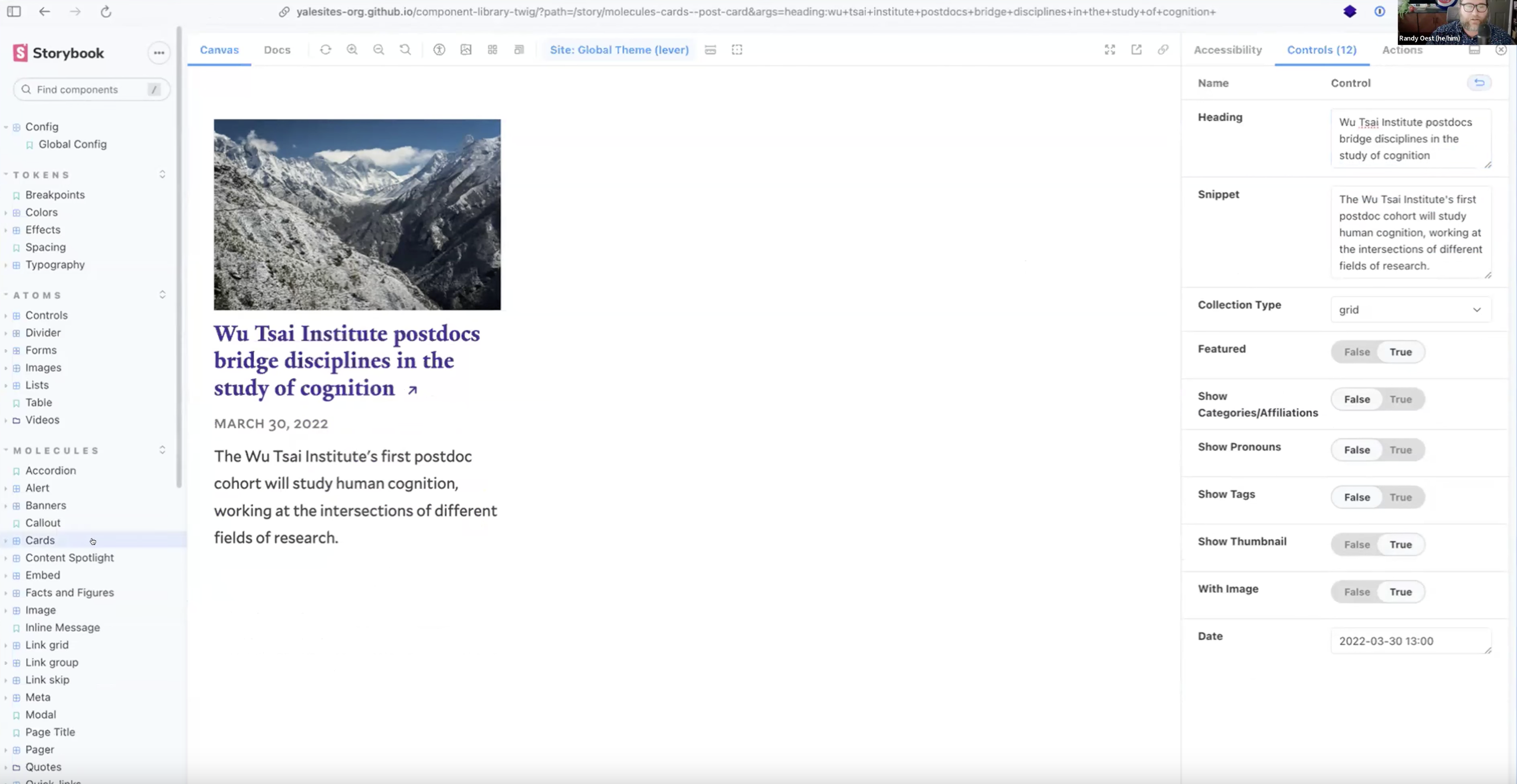
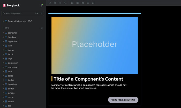
Storybook for Drupal
Storybook
Design System Library Tool
Storybook is the leading open-source software that developers use to build the components of a design system in isolation from the software that uses the components.
This allows developers to see:
- The full library of components and how they display
- How the components can be combined
- Variants of each component
- Documentation about how they should be used
- Front-end code needed to implement each component
Storybook is a type of software we often refer to as "component library", "pattern library", or "front-end workshop". I spent some time researching whether Storybook can be used as part of a Drupal theme to display a library of Single Directory Components.
Tools such as the Drupal Storybook module and Emulsify from Four Kitchens may help teams who wish to use Storybook for their Drupal design system.
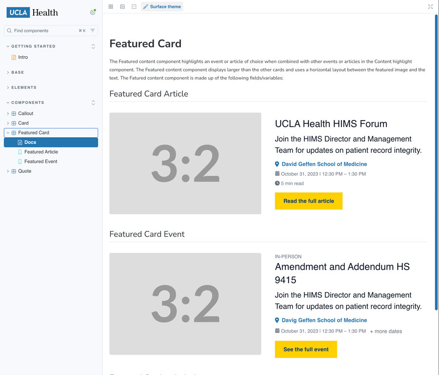
Notably, the developers at UCLA have created UCLA Surface, which uses Storybook to display a component library which is compatible with their Drupal theme. Developer Mario Hernandez provided excellent instructions here on how they did it.
Storybook Resources
SDC-ADDON
Simplifies Storybook for Drupal
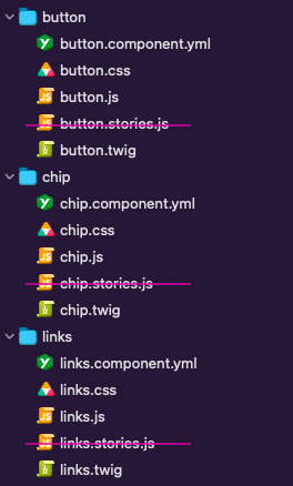
Storybook normally requires an additional stories.js file for each component.
SDC-Addon is an open source tool developed by Ivan Berdinsky. This addon allows us to build our components without the additional stories.js file.
Project Lead
📁 Storybook Component
- component.twig
- component.css
- component.js
- component.yml
component.stories.js(not needed with the add-on!)
SDC-Addon Resources
My Storybook for Drupal Research
Experimental Theme Development
I spent some time researching this by building a theme using Storybook and the SDC add-on. I found that as I added more components, Storybook became so slow that continuing the project was not a productive for me at that time.
The sdc add-on is in active development and is being continuously improved by the developer. Teams who find Storybook to be their ideal component library solution may find that the issues I have had will be resolved in the coming months.
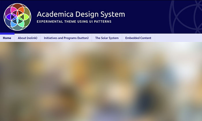
Academica
This is the first version of Academica that I created before building Academica 2.
Emulsify
Open-source Drupal Toolset
Emulsify is an open-source tool created by Four Kitchens to enable a Drupal theme to be built with a design system and with Storybook. It provides a base theme and UI component collection which can then be customized and extended by a developer. It helps to connect Drupal with Storybook.
Emulsify includes the BEM Twig extension, which helps to modernize component styling in Drupal to use BEM CSS architecture.
By contributing this tool to the open source community, Four Kitchens demonstrates their dedication and integrity. They are putting real work into helping our open source tools continue to grow and serve our needs as developers. Hats off to them!
- Emulsify uses Drupal's SDC feature
- Incorporates Storybook into a Drupal Theme
- Has an example basic component collection to get started with (Compound)
- Has an example theme to use as a scaffold for a custom theme
NOTE: I encountered several errors while trying to implement this tool which may or may not be related to Emulsify itself. I put a pin in this research with plans to circle back later.
Emulsify Resources
Additional Resources
For Storybook for Drupal
Articles
- Medium Article: Your Drupal Site Needs a Storybook Design System (this needs an updated response)
University Design Systems Using Storybook
Other Component Libraries
There has been some work done to help Drupal integration with PatternLab (Storybook's living ancestor). Of partivular interest is the BEM Twig extension, which helps Drupal to use correct modern CSS formatting (BEM) for integration with a PatternLab component library.
SDC Styleguide
Drupal Pattern Library Module
Drupal architect Alejandro Madrigal Leiva built the SDC Styleguide as a design system component library solution (alternative to Storybook and UI Patterns).
To use this tool:
- Install the module and enable it
- In your Drupal site, go to /styleguide/explorer (ddev local example: https://my-local-dev.ddev.site/styleguide/explorer)
SDC Styleguide Resources
What's Next?
Additional Tools to Explore
SDC Component Library
I recently read an article on the Drupal-SDC-Storybook topic written by Pri Scarabelli for Pivale. It brought to my attention a module called SDC Component Library, which appears to be another Drupal-native component library solution.
After installing the module, all my components are listed on a page at /components (ddev example: my-local-site.ddev.site/components). However, this module requires that each component have a .story.twig file. My themes so far have been set up to use story.yml files rather than story.twig files. I'll have to do some more work to see if using the SDC Component Library module and story.twig files has any advantage.
The display also has some issues for me. It doesn't support my dark mode theme due to the background colors in the display.
My Drupal Themes
Experimental, Work-in-Progress Drupal 11 Themes
Drupal Videos
Introductory Drupal Development
Drupal Articles
Things I've Written about Drupal