Popover
Adobe Spectrum CSS Token Migration
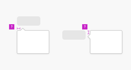
The triangular tip which points to the source of the popover needed to reflect the border style of popover. It also needed to be positioned and rotated precisely for each popover position, and overridden for right-to-left languages for the 10 logical positions.
Migration of popover required the addition of 22 position variants, 10 of which made use of logical properties.
Animations must work correctly for each position of popover, ensuring that as it appears, it moves slightly away from the source it refers to.
Related Links
Popover Challenges
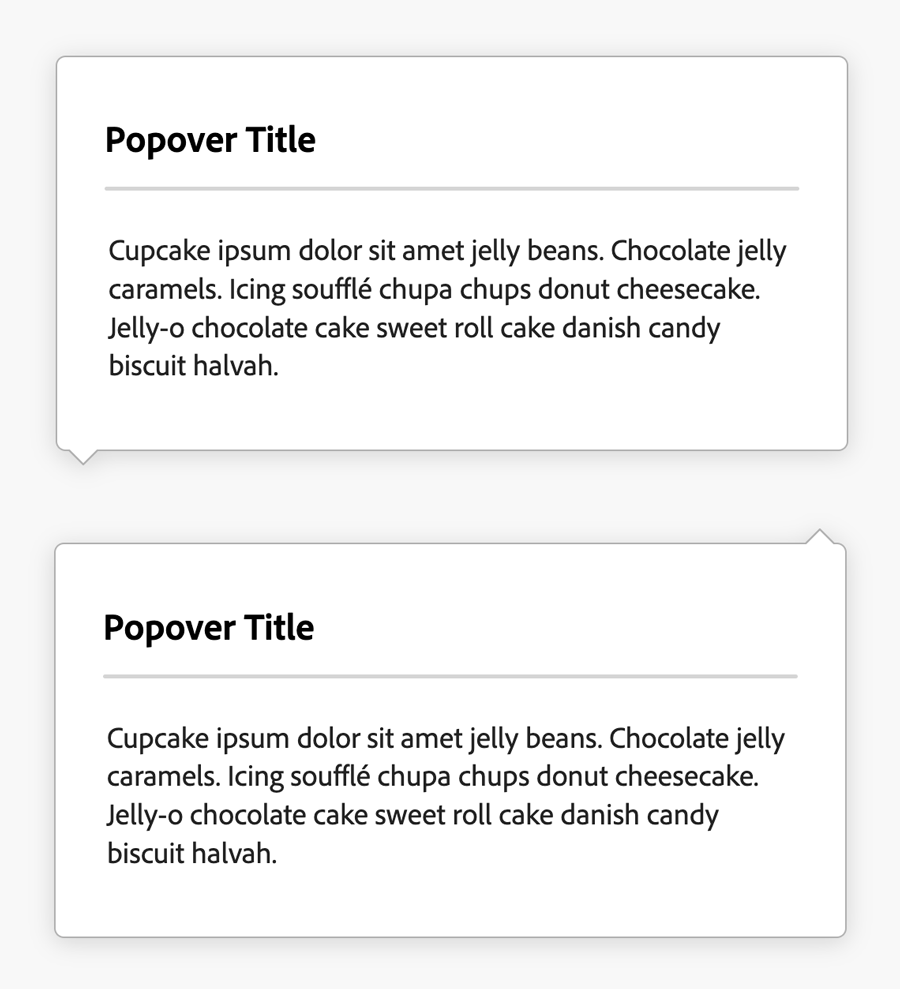
Triangle Tip
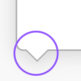
The popover tip is a small triangle which indicates the region of the screen that the popover refers to. The triangle required a background, stroke and shadow that blend seamlessly with the rest of the component. The border of the triangle connecting to the popover needed to be invisible.
The end result was an SVG with a viewBox cropping the long side of the graphic.
Placement Variations
Adobe's design specs included a list of 22 placement positions for Popover:
- top
- top left
- top right
- top start
- top end
- bottom
- bottom left
- bottom right
- bottom start
- bottom end
- left
- left top
- left bottom
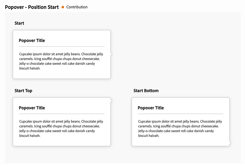
- start
- start top
- start bottom
- right
- right top
- right bottom
- end
- end top
- end bottom
To ensure I interpreted these positions correctly, I created a chart to share with the Adobe designers.
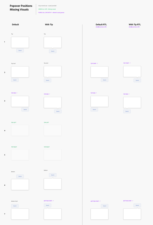
Select the image above to view full chart.
Placement Documentation
I added markup examples of each of the 22 placements to the documentation to ensure that developers knew which placement class to use for their application.
I used Adobe XD and Figma to illustrate design questions, such as in this visual representation of textfield markup and two possible helptext alignments.
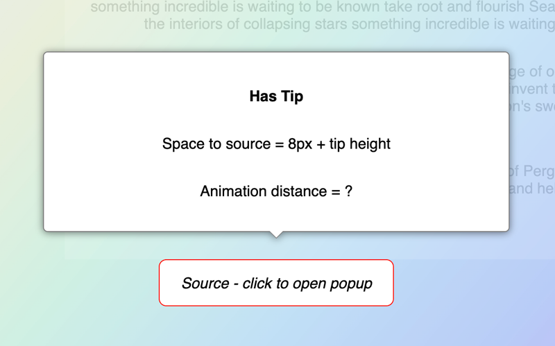
Animations
The popover must animate on open so that it appears to move away from the source. To ensure I interpreted the placement and animation distance correctly, I created a codepen demo.
Creative Code Comments
To ensure the animation direction was clear for each of the 22 placements, I used arrows in my code comments.
              /* popover position is at top of source - default placement */
              .spectrum-Popover--top,
              .spectrum-Popover--top-left,
              .spectrum-Popover--top-right,
              .spectrum-Popover--top-start,
              .spectrum-Popover--top-end {
              margin-bottom: var(--spectrum-popover-cross-offset);
              /* popover animates upward ⬆ */
                &.is-open {
                  @inherit: %spectrum-overlay--top--open;
                }
              }
Tip Distance from Corner
Our design specs showed that should the tip be placed at the corner of the popover, it should be a distance from that corner equal to the corner radius.
Due to the way the tip was constructed, it would be placed too far from the edge if we simply used the corner radius as the distance. To resolve this, half of the tip width had to be subtracted from the corner radius to create the correct distance.
Additionally, the tip's distance to the edge needed the ability to be overridden so as to center the tip over the source. I created a variable that could be used as a wildcard to insert the correct offset distance for a given application.
I created a diagram to ask the Adobe designers what the default tip distance to the edge should be.
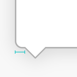
Adobe design specified that the default distance should be equal to the corner radius of the popover.
Popover CSS
Archived from 2022
/*Copyright 2022 Adobe. All rights reserved.This file is licensed to you under the Apache License, Version 2.0 (the "License");you may not use this file except in compliance with the License. You may obtain a copyof the License at http://www.apache.org/licenses/LICENSE-2.0Unless required by applicable law or agreed to in writing, software distributed underthe License is distributed on an "AS IS" BASIS, WITHOUT WARRANTIES OR REPRESENTATIONSOF ANY KIND, either express or implied. See the License for the specific languagegoverning permissions and limitations under the License.*/@import "../commons/overlay-coretokens.css";.spectrum-Popover {--spectrum-popover-cross-offset: 0; /* change to offset from source, default is 0 */--spectrum-popover-background-color: var(--spectrum-background-layer-2-color);--spectrum-popover-border-color: var(--spectrum-gray-400);/* popover inner padding */--spectrum-popover-content-area-spacing-vertical: var(--spectrum-popover-top-to-content-area);/* popover drop shadow */--spectrum-popover-shadow-horizontal: var(--spectrum-drop-shadow-x);--spectrum-popover-shadow-vertical: var(--spectrum-drop-shadow-y);--spectrum-popover-shadow-blur: var(--spectrum-drop-shadow-blur);--spectrum-popover-shadow-color: var(--spectrum-drop-shadow-color);/* popover corner radius */--spectrum-popover-corner-radius: var(--spectrum-corner-radius-100);/* pointer tip dimensions */--spectrum-popover-pointer-width: var(--spectrum-popover-tip-width);--spectrum-popover-pointer-height: var(--spectrum-popover-tip-height);/* pointer tip - default spacing to edge - corner radius plus half of tip width to neutralize override */--spectrum-popover-pointer-edge-offset: calc(var(--spectrum-corner-radius-100) + (var(--spectrum-popover-tip-width) / 2));/* pointer tip - spacing to edge will center pointer to source - apply in markup by setting '--spectrum-popover-pointer-edge-offset' value == half of source */--spectrum-popover-pointer-edge-spacing: calc(var(--spectrum-popover-pointer-edge-offset) - (var(--spectrum-popover-tip-width) / 2));}/* windows high contrast mode */@media (forced-colors: active) {.spectrum-Popover {--highcontrast-popover-border-color: CanvasText;}}.spectrum-Popover {@inherit: %spectrum-overlay;box-sizing: border-box;position: absolute;outline: none; /* Hide focus outline */padding: var(--mod-popover-content-area-spacing-vertical, var(--spectrum-popover-content-area-spacing-vertical)) 0;display: inline-flex;flex-direction: column;border-style: solid;border-radius: var(--mod-popover-corner-radius, var(--spectrum-popover-corner-radius));border-color: var(--highcontrast-popover-border-color, var(--mod-popover-border-color, var(--spectrum-popover-border-color)));border-width: var(--mod-popover-border-width, var(--spectrum-popover-border-width));background-color: var(--mod-popover-background-color, var(--spectrum-popover-background-color));filter: drop-shadow(var(--mod-popover-shadow-horizontal, var(--spectrum-popover-shadow-horizontal)) var(--mod-popover-shadow-vertical, var(--spectrum-popover-shadow-vertical)) var(--mod-popover-shadow-blur, var(--spectrum-popover-shadow-blur)) var(--mod-popover-shadow-color, var(--spectrum-popover-shadow-color)));/* default opens and animates upward */&.is-open {@inherit: %spectrum-overlay--open;}/* has tip triangle */&.spectrum-Popover--withTip {.spectrum-Popover-tip {/* triangle polygon */.spectrum-Popover-tip-triangle {stroke-linecap: square;stroke-linejoin: miter;fill: var(--mod-popover-background-color, var(--spectrum-popover-background-color));stroke: var(--mod-popover-border-color, var(--spectrum-popover-border-color));stroke-width: var(--mod-popover-border-width, var(--spectrum-popover-border-width));}}}}/* position naming - first position term is popover position, second term is source position *//* example: --top-left = popover is to top and source is to left *//* popover position is at top of source - default placement */.spectrum-Popover--top,.spectrum-Popover--top-left,.spectrum-Popover--top-right,.spectrum-Popover--top-start,.spectrum-Popover--top-end {margin-bottom: var(--spectrum-popover-cross-offset);/* popover animates upward ⬆ */&.is-open {@inherit: %spectrum-overlay--top--open;}}/* popover position is at bottom of source */.spectrum-Popover--bottom,.spectrum-Popover--bottom-left,.spectrum-Popover--bottom-right,.spectrum-Popover--bottom-start,.spectrum-Popover--bottom-end {margin-top: var(--spectrum-popover-cross-offset);/* popover animates downward ⬇ */&.is-open {@inherit: %spectrum-overlay--bottom--open;}}/* popover position is right of source */.spectrum-Popover--right,.spectrum-Popover--right-bottom,.spectrum-Popover--right-top {margin-left: var(--spectrum-popover-cross-offset);/* popover animates towards right ⮕ */&.is-open {@inherit: %spectrum-overlay--right--open;}}/* popover position is left of source */.spectrum-Popover--left,.spectrum-Popover--left-bottom,.spectrum-Popover--left-top {margin-right: var(--spectrum-popover-cross-offset);/* popover animates towards left ⬅ */&.is-open {@inherit: %spectrum-overlay--left--open;}}/* logical property - popover is horizontally at start */.spectrum-Popover--start,.spectrum-Popover--start-top,.spectrum-Popover--start-bottom {margin-inline-end: var(--spectrum-popover-cross-offset);/* LTR read, popover animates towards left ⬅ */&.is-open {@inherit: %spectrum-overlay--left--open;}/* RTL read, popover animates towards right ⮕ */[dir="rtl"] & {&.is-open {@inherit: %spectrum-overlay--right--open;}}}/* logical property - popover is horizontally at end */.spectrum-Popover--end,.spectrum-Popover--end-top,.spectrum-Popover--end-bottom {margin-inline-start: var(--spectrum-popover-cross-offset);/* LTR read, popover animates towards right ⮕ */&.is-open {@inherit: %spectrum-overlay--right--open;}/* RTL read, popover animates towards left ⬅ */[dir="rtl"] & {&.is-open {@inherit: %spectrum-overlay--left--open;}}}/* HAS TIP - popover with triangle pointer *//* default, top, and bottom position tip - tip defaults to pointing down ▽ */.spectrum-Popover--withTip {&.spectrum-Popover,&.spectrum-Popover--top,&.spectrum-Popover--top-left,&.spectrum-Popover--top-right,&.spectrum-Popover--top-start,&.spectrum-Popover--top-end,&.spectrum-Popover--bottom,&.spectrum-Popover--bottom-left,&.spectrum-Popover--bottom-right,&.spectrum-Popover--bottom-start,&.spectrum-Popover--bottom-end {.spectrum-Popover-tip {width: var(--mod-popover-pointer-width, var(--spectrum-popover-pointer-width));height: var(--mod-popover-pointer-height, var(--spectrum-popover-pointer-height));position: absolute;top: 100%;left: 0;right: 0;margin: auto;/* https://stackoverflow.com/questions/44170229/how-to-prevent-half-pixel-svg-shift-on-high-pixel-ratio-devices-retina */transform: translate(0, 0);}}/* popover is at top of source, tip left and pointing down ▽ */&.spectrum-Popover--top-left {.spectrum-Popover-tip {left: var(--mod-popover-pointer-edge-spacing, var(--spectrum-popover-pointer-edge-spacing));right: auto;}}/* popover is at top of source, tip right and pointing down ▽ */&.spectrum-Popover--top-right {.spectrum-Popover-tip {left: auto;right: var(--mod-popover-pointer-edge-spacing, var(--spectrum-popover-pointer-edge-spacing));}}/* logical property - popover is above, source and tip are at start, tip pointing down ▽ */&.spectrum-Popover--top-start {.spectrum-Popover-tip {margin-inline-start: var(--mod-popover-pointer-edge-spacing, var(--spectrum-popover-pointer-edge-spacing));}}/* logical property - popover is above, source and tip are at end, tip pointing down ▽ */&.spectrum-Popover--top-end {.spectrum-Popover-tip {margin-inline-end: var(--mod-popover-pointer-edge-spacing, var(--spectrum-popover-pointer-edge-spacing));}}/* popover position is bottom of source with tip pointing up △ */&.spectrum-Popover--bottom,&.spectrum-Popover--bottom-left,&.spectrum-Popover--bottom-right,&.spectrum-Popover--bottom-start,&.spectrum-Popover--bottom-end {.spectrum-Popover-tip {top: auto;bottom: 100%;/* flip triangle to face up */transform: scaleY(-1);}}/* popover position is bottom, source is at left, tip pointing up △ */&.spectrum-Popover--bottom-left {.spectrum-Popover-tip {left: var(--mod-popover-pointer-edge-spacing, var(--spectrum-popover-pointer-edge-spacing));right: auto;}}/* popover position is bottom, source is at right, tip pointing up △ */&.spectrum-Popover--bottom-right {.spectrum-Popover-tip {left: auto;right: var(--mod-popover-pointer-edge-spacing, var(--spectrum-popover-pointer-edge-spacing));}}/* logical property - popover is below, source is at start, tip pointing up △ */&.spectrum-Popover--bottom-start {.spectrum-Popover-tip {margin-inline-start: var(--mod-popover-pointer-edge-spacing, var(--spectrum-popover-pointer-edge-spacing));}}/* logical property - popover is below, source is at end, tip pointing up △ */&.spectrum-Popover--bottom-end {.spectrum-Popover-tip {margin-inline-end: var(--mod-popover-pointer-edge-spacing, var(--spectrum-popover-pointer-edge-spacing));}}/* right, left start, end popover position with tip default to pointing right ▷ */&.spectrum-Popover--left,&.spectrum-Popover--left-bottom,&.spectrum-Popover--left-top,&.spectrum-Popover--right,&.spectrum-Popover--right-bottom,&.spectrum-Popover--right-top,&.spectrum-Popover--start,&.spectrum-Popover--start-top,&.spectrum-Popover--start-bottom,&.spectrum-Popover--end,&.spectrum-Popover--end-top,&.spectrum-Popover--end-bottom {.spectrum-Popover-tip {/* swap height and width for vertical triangle */width: var(--mod-popover-pointer-height, var(--spectrum-popover-pointer-height));height: var(--mod-popover-pointer-width, var(--spectrum-popover-pointer-width));top: 0;bottom: 0;}/* left popover with tip pointing right ▷ */&.spectrum-Popover--left,&.spectrum-Popover--left-bottom,&.spectrum-Popover--left-top {.spectrum-Popover-tip {left: 100%;right: auto;}}/* right popover with tip pointing left ◁ */&.spectrum-Popover--right,&.spectrum-Popover--right-bottom,&.spectrum-Popover--right-top {.spectrum-Popover-tip {right: 100%;left: auto;/* flip tip to point left ◁ */transform: scaleX(-1);}}/* popover with tip at top */&.spectrum-Popover--right-top,&.spectrum-Popover--left-top,&.spectrum-Popover--start-top,&.spectrum-Popover--end-top {.spectrum-Popover-tip {top: var(--mod-popover-pointer-edge-spacing, var(--spectrum-popover-pointer-edge-spacing));bottom: auto;}}/* popover with tip at bottom */&.spectrum-Popover--right-bottom,&.spectrum-Popover--left-bottom,&.spectrum-Popover--start-bottom,&.spectrum-Popover--end-bottom {.spectrum-Popover-tip {top: auto;bottom: var(--mod-popover-pointer-edge-spacing, var(--spectrum-popover-pointer-edge-spacing));}}}/* logical property - start popover position with tip pointing toward end - LTR default is ▷ */&.spectrum-Popover--start,&.spectrum-Popover--start-top,&.spectrum-Popover--start-bottom {.spectrum-Popover-tip {margin-inline-start: 100%;[dir="rtl"] & {transform: none;/* flip tip to point left ◁ */transform: scaleX(-1);}}}/* logical property - end popover position with tip pointing toward start - LTR default is ◁ **/&.spectrum-Popover--end,&.spectrum-Popover--end-top,&.spectrum-Popover--end-bottom {/* tip triangle */.spectrum-Popover-tip {margin-inline-end: 100%;/* flip tip to point right ▷ */transform: scaleX(-1);[dir="rtl"] & {/* flip tip to point left ◁ */transform: scaleX(1);}}}}